Mooschool

About/background: It was only last year that I decided I wanted to take my work as an artist more seriously; that I wanted it to be more than just an activity I do in my spare time. Previous to that, I’d been developing my characters style for a couple of years and I really believed I had something unique which I wanted to explore full- time. I set myself targets: to get more stickers up in the streets, work on a bigger scale and exhibit in a gallery.
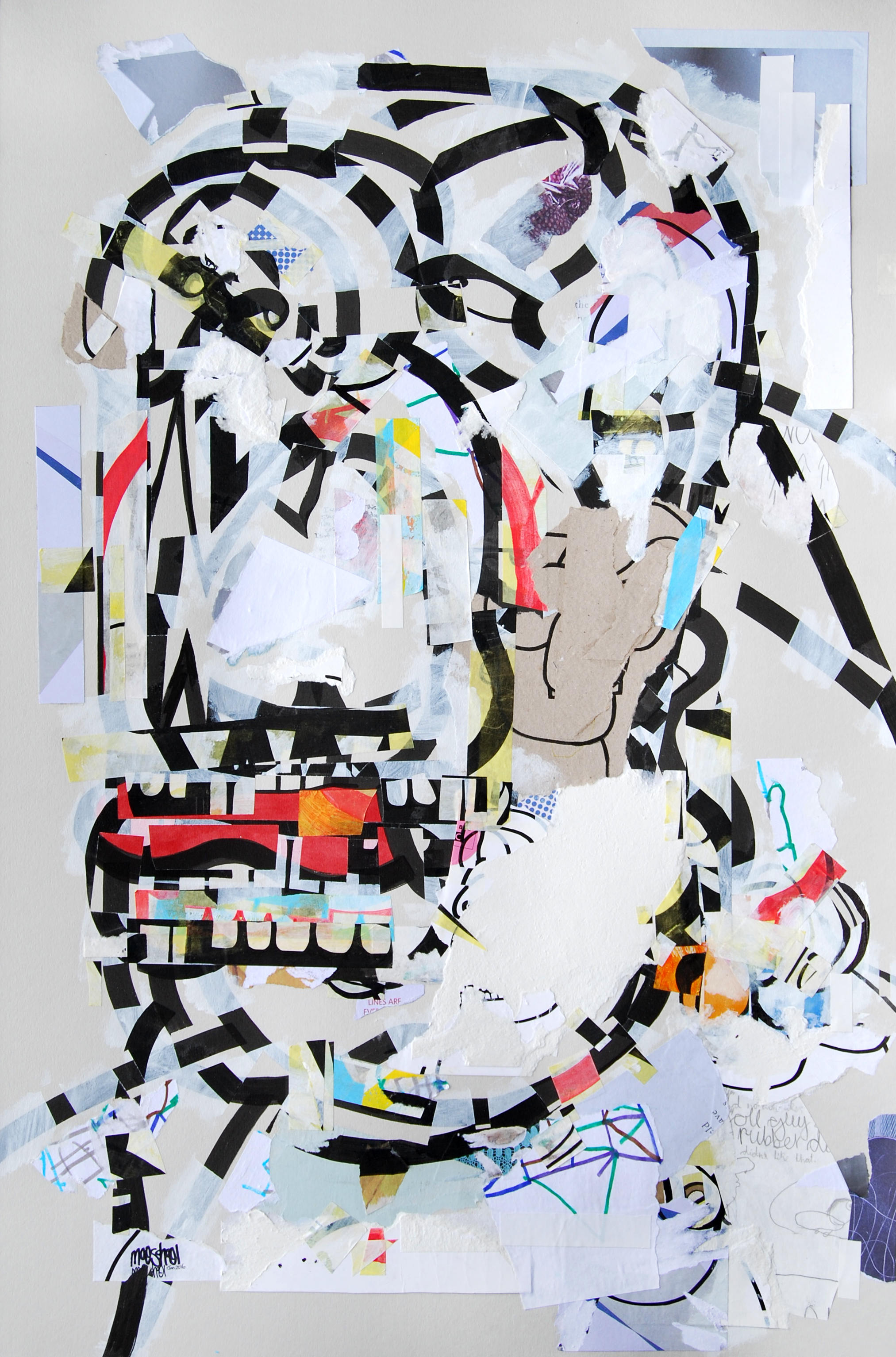
Back in 1995, I did a Foundation course in Art & Design, and that’s when I first started to develop this idea of layering a picture using graffiti, random scribblings and collage. But I lost my way a little bit. I was too focussed on these complex graffiti pieces that I’d never have time to finish. For one of my course projects, I’d filmed the development of a big picture, a time lapse basically, and I got a really good mark. This was the first step that took me away from fine art and towards motion graphics which is what I eventually developed a career in.
In 2004, I absolutely devoured a book by Tristan Manco called ‘Street logos’ which really inspired me to develop my own character designs on stickers. I used a website called Fotolog, an early Instagram basically, which had a good street art community. Unfortunately, the website faded after a year or two and when the sticker trades and feedback dried up, I’m ashamed to say my interest did too. I’m more confident about my style now but at the time I couldn’t work in isolation. I needed the feedback; the occasional pat on the back.
Then about 3 years ago, a guy in America, a sticker enthusiast and collector, contacted me complimenting me on my work. He’d been sent one of my stickers from a UK artist I’d traded with years ago. Something about that email, out of the blue, paying me a few compliments, really sparked my enthusiasm again and made me want to finish what I’d started.
Street art and the white cube: There’s a lot of influences I’ve drawn from graffiti or street art over the years but I’ve realised my fascination with it is how it develops spaces over time, by accident really. Throw-ups, tags, stickers or paste-ups applied over one another, getting ripped off and weathered, over time creates these amazing compositions. It’s man-made and yet it’s evolved in a very natural way.
I enjoy putting my stickers up in the streets but I don’t really consider myself a street artist. I’d rather just be known as an artist. I’m very happy seeing my work up in galleries. I’d love to put on a solo show in a gallery; to build a body of work that could take an audience through a narrative. I’ve been going to galleries since I was a teenager and I think they’re amazing places, unparalleled in allowing you to contemplate art.
Fragmented and partially erased: My process has become more complex over the years but it was born out of wanting to create something layered with more depth than just a single character drawing. That wasn’t enough for me in itself. Just like a vain attempt to whitewash graffiti from a wall, I tried painting a thin, white layer over my drawing then adding another offset character over the top. It created something far more dynamic and unpredictable. I started using masking tape to protect sections of the drawing from the paint and markers. When I peeled off the masking tape, I realised I had all these great leftover strips with bits of noses on, or lips or just random lines. I started keeping them on sheets of plastic to swap around and stick back on to different pictures. The character is really just a vehicle, a starting point for creating a new composition.
Disposability: Yes, that disposability is exciting. It’s fun sticking up your work in the street and quite liberating letting go of your work like that. Sometimes it’s gone the very next day but I don’t mind. I try to carry that ethos of ‘nothing is precious’ through all of my work, not just the stickers. But there’s also a resourcefulness to it that appeals to me; using what’s around you. I get quite a lot of catalogues through my door and some are printed on really nice paper stock so it made sense to take them apart and use them for my drawings.
Influences: I read a lot of art history when I was younger and I was really into the Cubists which I can relate to my work now. The Abstract Expressionists; Franz Kline, Rothko is amazing, the way he uses colour and space to draw you into a meditative experience. I’ve only just properly discovered Cy Twombly and Basquiat, his association with Warhol put me off a bit, but you can clearly see his influence in so much contemporary painting. Typically, in the age of the internet, I jump around a bit more these days and take my influences from a much broader range of artists, particularly via instagram.
Titles: I don’t really want the titles of my works to influence the viewer in any way so I keep most of my titles fairly straight and logical. I used to write a lot more random comments in my pictures and I would pick out a dominant one and use that but it still wouldn’t have told you anything much about the picture. My ‘Erratic Variations’ series title is a nod to the RB Kitaj painting, ‘Erasmus Variations’, which I saw at Tate Britain. It really started me thinking about how to merge my characters together into a bigger picture.
Studio/routine: I’m not yet financially able to work full-time on my art so I have to fit it around my motion graphics freelance work; in the evenings or when I don’t have work. I’ll tap down notes on my phone on the tube when I’m commuting to work, so when I do get a full day I’ll have a list of stuff I want to try that I can pick and choose from. I only have the kitchen table to work on at the moment so I’m restricted for space and it’s annoying having to clear my stuff away after each session. But that’s where I am at the moment and I’m looking forward to seeing how my own studio space will affect my work one day.
What's next: I don’t look too far ahead with my work. I have a big list of things I want to try such as printing or incorporating my motion graphics work somehow but I enjoy making incremental changes of technique or medium that creates a small step forward in my work. I don’t like the idea of jumping around too much. I feel like I have a strong idea behind my work that I want to evolve over the next 5, 10, 20 years. Maybe my character will have totally abstracted in 5 or 10 years, I don’t know. I don’t really want to know. I honestly feel like it’ll chart its own course and I‘ll just give it a nudge occasionally.
Future shows: I’m working hard this year to develop a stronger portfolio of larger works that I can confidently approach galleries with. I’m applying to open call exhibitions like the Royal Academy Summer show and just doing whatever I can to get noticed and generate opportunities.
Publishing date of this interview 08/03/16


