Luke Skiffington

"The spark for these works came from a visit to the Bauhaus Archive in Berlin, more specifically from a postcard I found in the shop there"
Could you tell us a bit about yourself. How long have you been a practicing artist and where did you study?
After a foundation year at Warwickshire College, I studied at Goldsmiths in the late nineties and graduated in 2000. I suppose I’ve been making work and exhibiting fairly consistently for around 16 years. I started to show work in collaborative group shows whilst at Goldsmiths and I’ve tried to exhibit regularly since then. In 2003-04 I did an MA at Chelsea College of Art in the final year of it being at Bagleys Lane, near Chelsea Harbour.
Like most artists, I’ve done a long list of very dull part-time jobs. However, I’ve been lucky to work for a number of artists as an assistant, which paid better, involved the odd boozy lunch and was far more engaging. Right now, my time is divided between the studio, part-time teaching and looking after our two year old son.
Mr Bauhaus (conversation), 2015
Mr Bauhaus (telepath), 2015
Best Foot Forward 5, 2015
Your series of paintings called “Mr Bauhaus” are full of fragmented hard edge shapes, could you tell us about this series of works and the thoughts behind it?
The spark for these works came from a visit to the Bauhaus Archive in Berlin, more specifically from a postcard I found in the shop there. The original image is from a graphic designed by Oskar Schlemmer in the 1920’s which was used on a poster advertising one of the first exhibitions of Bauhaus art. I also realised I recognised it from the albums of the band Bauhaus.
At that time, I was starting to make a number of works that alluded to heads or portraits, and the Schlemmer design seemed to offer me a development from that. I responded to the image’s austere qualities, its simplicity and its history as a kind of logo for the Bauhaus. In a contemporary context, the image probably borders on cliche, an idea I wanted to take on while trying to avoid making paintings that were cynical or ironic!
The small scale and uniform formats were important decisions in making the “Mr Bauhaus” paintings, as I wanted to stress their associations to the average proportions of a human head. They tend to be begun in groups, going through different guises as they develop, often with long periods of time (and other paintings) between layers. At a certain point they can move, quite drastically away from the original image and develop an identity of their own that couldn't have been arrived at by other means.
Their hard edged qualities felt appropriate in relation to the original image, however, this is often offset with a sense of mark, colour modulations and different transparencies of paint. If they become too polished or slick, I’ll want to throw something in the mix to disrupt this which often involves about spending as much time removing paint as applying it to the surface.
Attempting to keep the painting between two states is the main challenge. I want to retain the graphic qualities of their origins whilst also searching for a more ambiguous, nuanced space for the work to occupy.
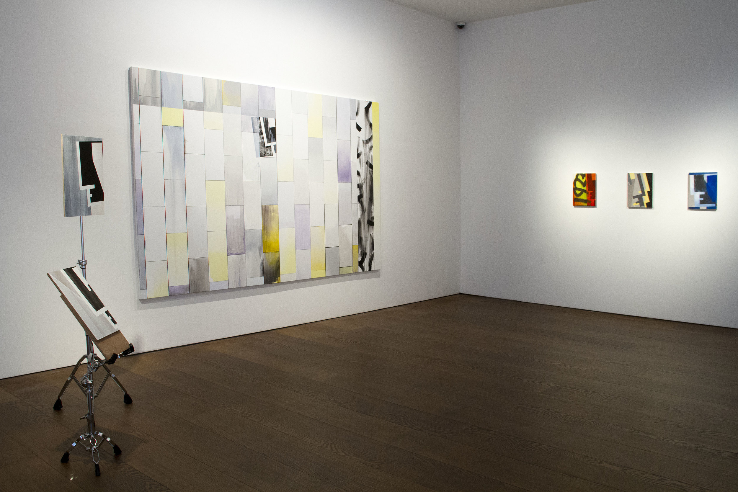
Artist of the Day, installation view, Flowers Gallery, 2016
Some of your works are displayed on drum stands, could you talk a bit about the reasons for this?
For quite a long time, I had been thinking about making freestanding pieces but I was unsure about what form that might take. I wanted to take the work off the wall and allow the audience to create different viewpoints, using other paintings as a kind of backdrop or environment for the drum stands to inhabit.
A solution came about through a lucky find. There is a music rehearsal space next door to my studio, and there were a number of old drum stands that had been thrown out, so I adopted them hoping they were definitely being thrown out and not needed for a gig somewhere!
The stands already had many sculptural qualities that seemed to mirror what was happening in the paintings and I considered using them as they were but quickly decided that they needed to be added to somehow. In contrast to the paintings, the sculpturesimagery is more stripped back and up to now have mostly been restricted to black and white alongside the colour of the support.
With their obvious associations to the figure, I became interested in how they could interact with other works, creating conversations between individual pieces and the space in which they are shown.
What do you hope the viewer gains/reacts from looking at your work?
I hope that they gain something! To be honest, I rarely consider the viewer directly as I get lost in other concerns of the work. While my references are quite specific, it is important for me that the viewer can go beyond any concept and enter the work on different levels. I hope my work has a slow burn quality after an initial visual impact.
How do you go about naming your work?
For me, how work is titled is really important, it can both distract and direct the viewer in certain directions. I’m interested in the different ways artists use titles, the title as a descriptive, as a number in an ongoing sequence or as giving clues to the background or origin of the work. For me, I tend to see the title as both a classification and an addition to the work. Many of my titles come from what I’m reading or music that I listen to in the studio. My titles often have two parts; the name of a group of works followed by something more specific in brackets.
Mr Bauhaus (construction), 2015
Mr Bauhaus (blue screen), 2016
Wall of windows (divider), 2016
What artwork have you seen recently that has resonated with you?
I’d probably come up with a different list if I answered this again tomorrow!
The James Turrell Retrospective at LACMA, California that I saw back in 2014 immediately springs to mind. On a very different tack, I saw a show (at the Berlinische Galerie, in Berlin) last November about the German gallery owner and publisher Rene Block which featured exhibition posters, multiples and written correspondence with artists.
This summer I enjoyed the Mary Heilmann exhibition at Whitechapel which felt very fresh as did Alex Katz at the Serpentine and Guillermo Kuitica at Hauser & Wirth, London. More recently, I really liked Denzil Forrester at Tramps, London and I’m looking forward to seeing Paul Nash at Tate Britain and Abstract Expressionism at the Royal Academy amongst others…
Tell us a bit about how you spend your day/studio routine, what is your studio like?
I tend to work longer hours nowadays, getting to the studio for 8.30-9 and working through until 6.30-7, sometimes longer depending on the season. In the summer I was working late at night a lot and it seems easier to get into a more intense, immersive state at that time of day. Coffee and music help to get started and often the choice of music sets the tone and a rhythm for the days work. I do tend to spend too much time looking at Instagram or deciding what the next step is going to be! Somedays it feels like you're treading water, but It feels important to clock-on, even if you don't lift tools.
What does the future hold for you as an artist? Is there anything new and exciting in the pipeline you would like to tell us about?
There are a number of larger scale “Wall of windows” paintings in the studio that I am trying to resolve. I’m beginning a new group of sculptures that will mix different kinds of image and support. I’d also like to make a book/publication incorporating prints and drawings that relate to the “Mr Bauhaus” series.
I have some work included in a group show at Maddox Arts, London at the moment. I’ll also be included in ‘Small is Beautiful 2016’ at Flowers, London (Cork Street) this December which runs until 7th January 2017.
Publish date: 25/11/16
All images are courtesy of the artist


